

Take a look at the chart below and perform the task as outlined:
This graph shows the proportion of four different materials that were recycled from 1982 to 2010 in a particular country.
Summarise the information by selecting and reporting the main features, making comparisons where relevant.

The graph below shows the population of India and China from the year 2000 to the present day with projections for growth to the year 2050.
Summarise the information by selecting and reporting the main features, and make comparisons where relevant.
Write at least 150 words.

Try this process diagram question about the manmade process of hydroelectricity.
The diagram shows how electricity is generated by a hydroelectric dam.
Write a 150-word report for a university lecturer explaining how the process works.

The bar chart shows the relative electricity consumption and cost per year of various household devices.
Summarise the information by selecting and reporting the main features, and make comparisons where relevant.
Write at least 150 words.

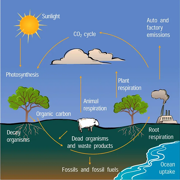
The diagram below illustrates the carbon cycle in nature. Write a description of this repeating cycle.
Write at least 150 words.
Summarise the information by selecting and reporting the main features, and make comparisons where relevant.
Write at least 150 words.

The pie charts below compare the different kinds of energy production in France for two years.
Write at least 150 words.
